This one’s for the absolute beginners. Once you’ve learned how the box model works, and how to float those boxes, it’s time to get serious about your CSS. To that end, we’ve compiled a massive list of tips, tricks, techniques, and the occasional dirty hack to help you build the design you want.
CSS can get tricky, and you should too. And now, in no particular order, (almost) everything you’ll need to know:
FREE FIRST MONTH: MILLIONS OF FONTS, FREEBIES & DESIGN ASSETS
Web Fonts7,864 FontsWebsite Mockups7,478 MockupsPhotoshop Actions1,912 Photoshop ActionsFree First Month of| Exclusively with WebDesignerDepot
1. Absolute positioning
If you want control over where an element lives on our website at all times, absolute positioning is the key to making this happen. If you think of your browser as one big bounding box, absolute positioning allows you to control exactly where in that box an element will stay. Use top, right, bottom and left, accompanied by a pixel value to control where an element stays.
position:absolute;
top:20px;
right:20px
The CSS above sets the position of an element to stay 20px from the top and right edges of your browser. You can also use absolute positioning inside of a div.
2. * + selector
The * enables you to select all elements of a particular selector. For example, if you used *p and then added CSS styles to that, it would do it to all elements in your document with a <p> tag. This makes it easy to target parts of your website globally.
3. Overriding all styles
This should be used sparingly, because if you do this for everything, you’re going to find yourself in trouble in the long run. However, if you want to override another CSS style for a specific element, use !important after the style in your css. For example, if I wanted the H2 headers in a specific section of my site to be red instead of blue, I would use the following CSS:
.section h2 { color:red !important; }4. Centering
Centering is tricky, because it depends on what you’re trying to center. Let’s take a look at the CSS of items to be centered, based on content.
TEXT
Text is centered using the text-align:center;. If you want it to either side, use left or right instead of center.
CONTENT
A div (or any other element) can be centered by adding the block property to it, and then using auto margins. The CSS would look like this:
#div1 {
    display: block;
    margin: auto;
    width: anything under 100%
}
The reason I put “anything under 100%” for width is because if it was 100% wide, then if would be full-width and wouldn’t need centering. It is best to have a fixed width, like 60% or 550px, etc.
5. Vertical alignment (for one line of text)
You will use this in a CSS navigation menu, I can almost guarantee that. The key is to make the height of the menu and the line-height of the text the same. I see this technique a lot when I go back and edit existing websites for clients. Here’s an example:
.nav li{
    line-height:50px;
    height:50px;
}
6. Hover effects
This is used for buttons, text links, bock sections of your site, icons, and more. If you want something to change colors when someone hovers their mouse over it, use the same CSS, but add :hover to it and change the styling. Here’s an example:
.entry h2{
    font-size:36px;
    color:#000;
    font-weight:800;
}

.entry h2:hover{
    color:#f00;
}
What this does is it changes the color of your h2 tag from black to red when someone hovers over it. The great thing about using :hover is that you don’t have to declare the font-size or weight again, if it isn’t changing. It only changes what you specify.
TRANSITION
For hover effects, like with menus or on images in your website, you don’t want colors snapping too quickly to the end result. You ideally want to ease the change in gradually, which is where the transition property comes into play.
.entry h2:hover{
    color:#f00;
    transition: all 0.3s ease;
}
This makes the change happen over .3 seconds, instead of just instantly snapping to red. This makes the hover effect more pleasing to the eye and less jarring.
7. Link states
These styles are missed by a lot of designers, and it really causes usability issues with your visitors. The :link pseudo-class controls all links that haven’t been clicked on yet. The :visited pseudo class handles the styling of all of the links you’ve already visited. This tells website visitors where they have already been on your site, and where they have yet to explore.
a:link { color: blue; }
a:visited { color: purple; }
8. Easily resize images to fit
Sometimes you get in a pinch where images need to fit a certain width, while scaling proportionally. An easy way to do this is to use max width to handle this. Here is an example:
img {
    max-width:100%;
    height:auto;
}
This means that the largest the image could ever be is 100%, and the height is automatically calculated, based on the image width. In some cases, you might have to also have to specify the width at 100%.
9. Control the elements of a section
Using the image example above, if you only want to target the images of a certain section, like your blog, use a class for the blog section, and combine it with the actual selector. This will enable you to select only the images of the blog section, and not other images, such as your logo, or social meia icons, or images in any other sections of your site, like the sidebar. Here’s how the CSS would look:
.blog img{
    max-width:100%;
    height:auto;
}
10. Direct children
I wish I’d known this when I first started out using CSS. This would have saved me so much time! Use > to select the direct children of an element. For example:
#footer > aThis will select and style all of the active link elements that are immediately under the Footer ID. It won’t select anything past the active element, or anything else contained in the footer, like plain text. This works great with top level navigation elements, too.
SPECIFIC CHILD ELEMENTS
Believe me, this is handy when you are styling lists. You just need to count how many items down the element is that you want to style and then apply that style.
li:nth-child(2) {
    font-weight:800;
    color: blue;
    text-style:underline;
}
The CSS above targets the second item in the list and makes it bold, underlined, and blue. Add an “n” after the number in parenthesis and you can target every 2nd list item. Imagine being able to style every other line in a table-style layout for easy reading. The CSS would be:
li:nth-child(2)11. Apply CSS to multiple classes, or selectors
Let’s say you wanted to add an identical border around all images, the blog section and the sidebar. You don’t have to write out the same exact CSS 3 times. Just list those items out, separated by commas. Here is an example:
.blog, img, .sidebar {
    border: 1px solid #000;
}
Whether you’ve been a web designer for years, or you’re just starting out, learning how to build websites the right way can seem like a rocky, never-ending journey. Once you’ve narrowed down which languages you want to learn, you have to learn and refine your skills.
No matter what you learn, CSS is one of those essential, but daunting skills you have to master. It doesn’t have to be so difficult, though, especially if you know a few handy and lesser-known CSS techniques to get the job done.
12. box-sizing: border-box;
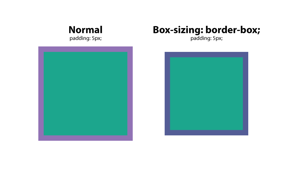
This is a favorite among many web designers, because it solves the problem of padding and layout issues. Basically, when you set a box to a specific width, and add padding to it, the padding adds to the size of the box. However, with box-sizing:border-box;, this is negated, and boxes stay the size they are meant to be.
13. :before
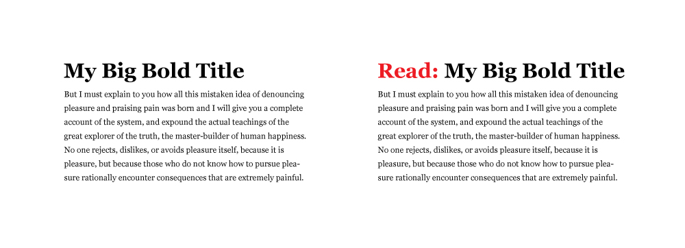
This CSS is a selector that allows you to choose a CSS element and insert content before every element with a specific class applied to it. Let’s say you had a website where you wanted specific text before every H2 tag. You would us this setup:
h2:before {
    content: "Read: ";
<span class="Apple-converted-space">    color: #F00;</span>
}
This is extremely handy, especially if you are using an icon font. You can place icons before certain elements, and apply it globally.
14. :after
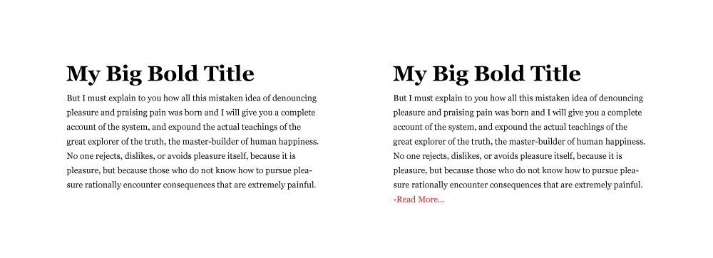
Like the :before selector, you can use :after to insert content globally on specific elements. A practical use would be adding “read more” after every excerpt on a blog. Here’s how you would do that.
p:after{
    content: " -Read more… ";
    color:#f00;
}
15. content
content is a CSS property that comes in handy when you need to insert an element that you want to be able to control. The most common use I’ve seen for this is to insert an icon from an icon font in a specific place. In the examples above, you can see that you have to wrap the text you want to insert in quotation marks.
16. CSS reset
Different browsers have default CSS settings, so it is a must to reset those, so you have an even, consistent playing field. Think of it as building a house, and whether you build on the side of a mountain, on a sandy beach, or on the middle of a wooded area, you want that foundation to be level.
This CSS reset method sets a standard base for all of your websites, giving them consistency in their CSS starting point. It removes unwanted borders, preset margins, padding, lines heights, styles on lists, etc. Eric Meyer created one that works well.
17. Drop caps
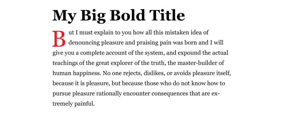
Everyone loves drop caps. It reminds us of the traditional printed book, and is a great way to start a page of content. That 1st, large letter really grabs your attention. There’s an easy way to create a drop cap in css, and it’s by using the pseudo element: :first letter. Here’s an example :
p:first-letter{
    display:block;
    float:left;
    margin:3px;
    color:#f00;
    font-size:300%;
}
What this does is set the letter to 3x the size of the other letters. It sets 3px of space around the letter to prevent overlapping, and sets the color of the letter to red.
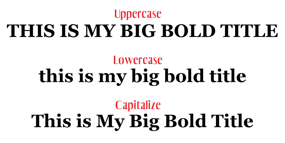
18. Force text to be all caps, all lowercase, or capitalized
It would be absurd to type an entire section in all caps. Imagine having to go back and fix that later when the format of the website changes, or it gets updated. Instead, use the following css styles to force text to a certain formatting. This css targets the h2 title tag.
- h2 { text-transform: uppercase; } – all caps
- h2 { text-transform: lowercase; } – all lowercase
- h2 { text-transform: capitalize; } – capitalizes the 1st letter of each word.
19. Vertical screen height
Sometimes you want a section to fill the entire screen, no matter what the screen size is. You can control this with vh, or view height. The number before it is a percentage, so if you want it to fill 100% of the browser, you would set it to 100. You might set it to a value like 85% to accommodate a fixed navigation menu.
Create a class for the container and apply the amount of vh you want it to have. One thing you may need to tweak is the media query value for specific screens or orientations like phones in portrait mode. Imagine stretching a landscape image to fit portrait mode. That just wouldn’t look good.
.fullheight { height: 85vh; }20. Style telephone links
If you have a link that calls a phone number when a user taps it on their phone, you may have trouble styling it with the traditional active link selector. Instead, use the following CSS:
a[href^=tel] {
<span class="Apple-converted-space">    color: #FFF;</span>
<span class="Apple-converted-space">    text-decoration: none;</span>
}